A front-end quality assurance tool for software engineers.
ROLE
TIME
PROJECT HIGHLIGHTS
User research, Product design, Ui/Ux design, Branding, Prototyping
We have. All the time.
We found out that many other software engineers and designers face this problem too.
In January 2024, my team—consisting of a PM, designer (that’s me!), and two developers—set out to enhance quality assurance by bridging the gap between design and coding.
[Pixel will solve the entire tedious process with one button!]
STEP 1
Identify
Meeting with team to understand everyone's goals, identifying common interest and problem spaces we want to solve.
STEP 2
Research
Understand problem space and gather insights from users to learn about their needs and pain points.
STEP 3
Empathize
Put ourselves in the user’s position to gain a deeper understanding of their pain points.
STEP 3
Define
Clarifying, organizing, and prioritizing issues found in the process of design-to-code.
STEP 4
Ideate
Creating user flows and wireframes. Taking best options and adding visual design to optimize user experience.
STEP 5
Demo
Running product demo to gather feedback. Pitched in front of 250+ audiences and judges.

Making sure your product is pixel perfect
We talked to over 60 people across several industries and companies of different scale.
The development of Pixel was rooted in comprehensive user research phase that sought to understand the nuanced needs and challenges faced by front-end developers, designers, and product managers in the field.
We learned about their work, their frustrations, their wishes, and more.
Interview Questions
Can you explain your usual procedure for transitioning from design to development?
This kick-off question initiates an in-depth look into the user's handoff process. It enables a deeper understanding of user workflow and any pain points within the design-to-development transition, shaping the user journey for synthesis.
What are your current solutions for checking developer accuracy in regards to the designs they were given?
By exploring current verification methods, this question provides insight into user preferences and identifies any gaps in existing solutions for ensuring accuracy.
What is your process for building out the front end once given a design?
This question allows us to understand the developer's perspective, uncovering any challenges faced in translating designs into functional code and highlighting areas Pixel could streamline.
What does the process look like for designer after handoff?
Asking designers about their role post-handoff reveals unmet needs and helps us understand how Pixel can assist designers in overseeing development.
What’s your overall satisfaction with the current solution? Are there any issues with communication or handoff that impact efficiency?
This question assesses user satisfaction, uncovering broader communication or workflow challenges that Pixel might address to enhance overall efficiency. It is designed to facilitate surprises and unexpected insights, expanding my perspective beyond the initial design scope.
Here are a few highlights of what they said:
"There’s usually minor disconnect between what’s designed and the coded product, and it’s hard to catch."
Software Engineer at Startup
"I spend a lot of time going back and forth with developers to fix small visual inconsistencies, and it’s very time consuming."
Product Designer at Tech
"We struggle with having a reliable system to make sure that designs are consistently implemented during the software development process."
Product Manager at Startup
Research Synthesis
💡
This means that teams spend hours trying to make sure a coded product looks like the original design.
[Minor differences may seem insignificant, but added together makes a big difference.]
Knowing the Audience
Through secondary research and interview validation, we found that…
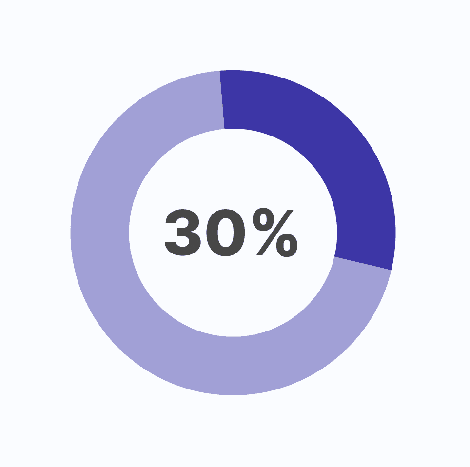
Designers and engineers spend as much as 30% of their time working together on quality assurance
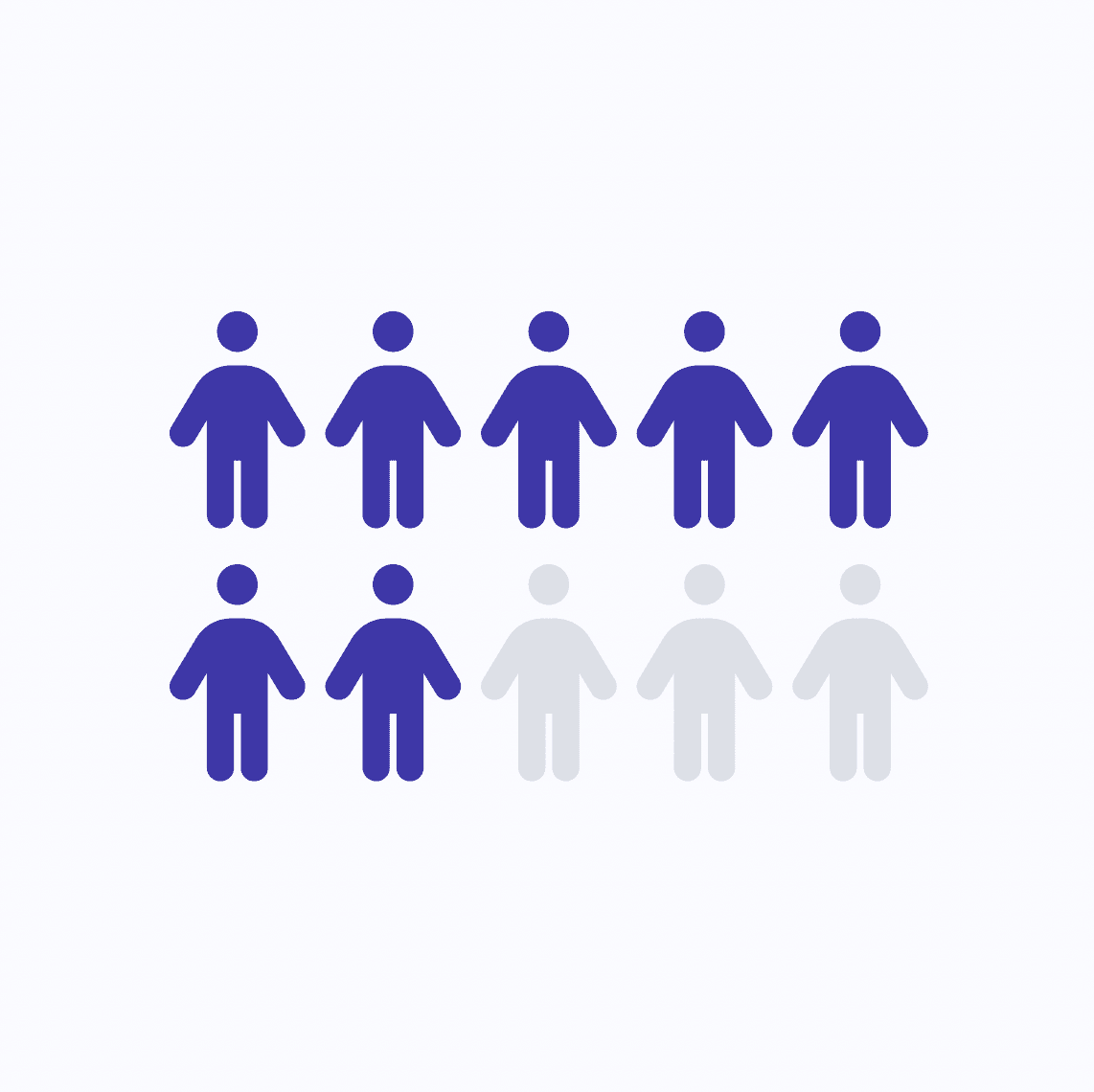
Nearly 7/10 teams experience visual gaps between design and final product, resulting in increased project timelines.
Over 96% of design teams agree that a lack of design-code alignment leads to diminished product quality.
Competitive Audit
Tools that streamline the design-to-development handoff process are popping up everywhere.
Figma has introduced a dev mode that converts designs into basic code, while platforms like Zeplin enhance collaboration between UI designers and front-end developers.
However, what's missing is a product that focuses on quality at the very end of the development process. Other tools on the market don’t tackle the core issue of the exhausting guess and check process.
Missing Product
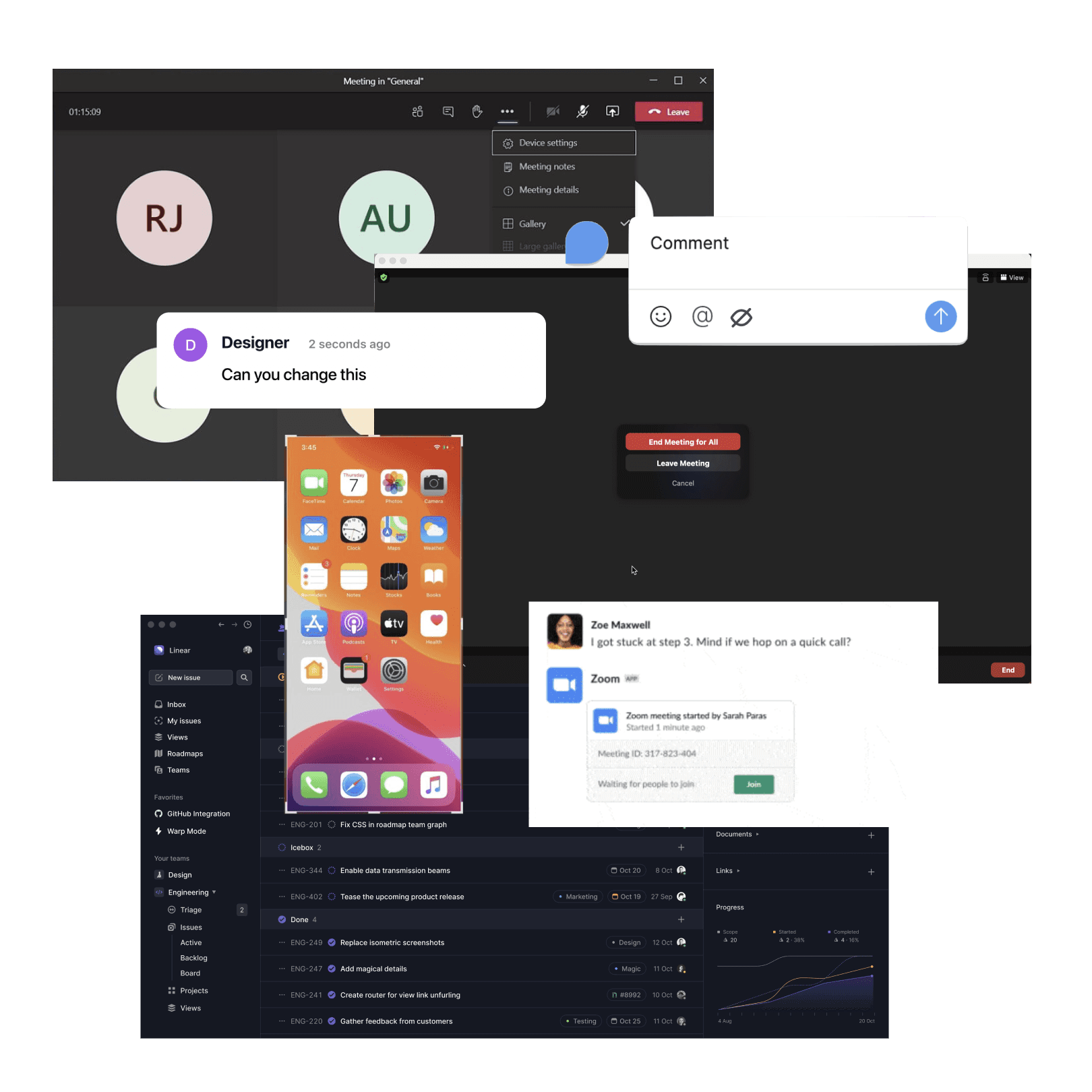
Currently, the standard process involves extensive Zoom meetings to discuss the designer's specific comments and callouts.
While some larger companies have developed internal tools to aid in front-end quality assurance, smaller companies and startups often lack the resources to prioritize such tools

PROBLEM STATEMENT
Design quality assurance is frustrating and tedious.
💡
How might we streamline the design-to-development handoff to make workflows smoother and efficient?
[Thousands of notifications from designer manually highlighting the differences in screens]
Pixel, making sure your design match to code
Pixel serves as an all-in-one front-end quality assurance specialist, dedicated to ensuring that the designer's vision is accurately implemented in code.
It is not uncommon for details like margins, border-radius, and specific hex codes to get lost in translation. Pixel acts as the final checkpoint before a product is launched, guaranteeing that these elements are preserved.
STEP 1
Enter Figma and Prototype Link
Enter Figma File and Prototype Link and Pixel will scrape all pages and frames within your Figma file, in addition to all links stemming from the root link you pasted as your prototype.
STEP 2
Choose Frame and Page
Pick the corresponding page and frame within your Figma file, along with the specific page URL for the prototype page you want to check. This allows the user to upload only two links at the start, and then have the opportunity to check all pages from that single upload.
STEP 3
Annotated Screen
Pixel will output an annotated screen of all discrepancies present in the deployed prototype when compared to the original Figma design. This creates a visual indicator of where the errors occur, allowing the user to identify and change these mistakes with ease.
STEP 4
Detailed Comments
Pixel creates a list of comments describing each of the discrepancies identified. These comments describe the location of the error on the page, and give insight to what may be the potential cause for the indicated discrepancy (margin, color, text, etc.).
STEP 5
Code Callouts
Pixel creates a callout of the specific code related to the element causing the discrepancy. This code included both the HTML of the element and the corresponding CSS that is styling the element.
*To click through the presentation, use the arrows near the bottom of the embed
Pixel was one of the most rewarding projects I've worked on. It taught me how to streamline complex design processes into a cohesive solution for a real-world problem. Bridging the gap between design and development seems straightforward, but the details and challenges are endless. How do we ensure visual fidelity while maintaining efficiency in a fast-paced development cycle? How do we create a seamless handoff that works for both designers and engineers?
I wore multiple hats, from leading product design to overseeing branding, pitch decks, and every visual aspect of Pixel. The project pushed me beyond my limits, refining my design skills and teaching me to adapt and problem-solve. More than just creating a product, I was building resilience and growing both as a designer and an entrepreneur.
A huge thank you to my lovely team: Elvira Lu, Nick Marker, and Sifa Wangia.
I couldn’t have done it without you guys!


